Probabilistic Risk Assessment
- Risk assessments are often subject to large uncertainties
- We often model these uncertainties probabilistically (as if uncertain quantity were subject to random variability)
- Propagate these uncertainties through our model
This section presents a description of how a probabilistic risk assessment is performed using a common technique called Monte Carlo analysis. You may implement this same example in a tutorial which provides step by step instructions for recreating the analysis presented here (Tutorials).
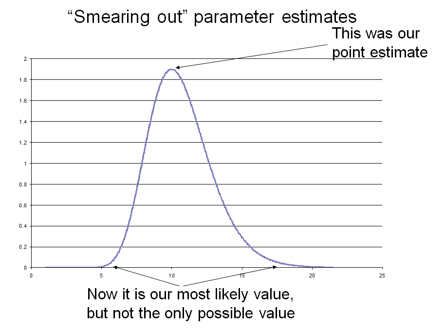
Making Inputs Probability Distributions Instead of Points: "Smearing out" parameter estimates
- Replace fixed value with probability distribution
- Mean dose =10
- Note that exponential and Beta-Poisson dose-response functions allow for typical variability in concentration (Poisson variability) around a known mean
- But suppose we don’t know true average dose?
- Or average dose varies from day to day
- Ln(mean concentration) ~ N (2.3, 0.212)
Propagating uncertainty
- Usually use the same formulae as your point estimate
- Parameters are not single values but probability distributions
Uncertainty propagation (a little more formally)
- Model F(x) where x is a vector of model inputs (parameters)
- Given probability distributions for x, what is distribution of F(x)?
- Propagation of uncertainty through model
- From inputs to outputs
Monte Carlo Uncertainty Analysis
- There are different ways to propagate uncertainty in input through a risk model
- Monte Carlo is a widely used and generally applicable method
- Monte Carlo analysis can be considered the "work horse" of probabilistic risk assessment (PRA)
- Here's how Monte Carlo analysis works:
Computers have algorithms to generate random numbers from specified probability distributions. To implement Monte Carlo analysis we generate or “sample” value for inputs X1 and X2 from probability distributions describing the uncertainty in these inputs. Then we calculate the corresponding output of our risk model Y = F(X1, X2). We repeat this N times, and each Y value is equally plausible so we have a discrete probability distribution of our output prob [Yi] = 1/N For small numbers of N (samples and calculation of the model the estimated distribution of Y may be inaccurate as there is a lot of random variability in the estimates of Y. If we take a large number of samples, this discrete probability distribution of Y will come increasingly close to the true distribution Y, as the sampling variability will average out.
Monte Carlo Results
- Have a discrete distribution of Y that approximates true distribution of Y
- E[Y] = ΣYi/N
- Var[Y] = Σ{Yi – E[Y]}^2 /(N-1)
- True percentiles of Y ~= percentile of Yi values
- Typically summarize by mean, median, upper bound, and lower bound
Monte Carlo implementation
- Add on software packages for Excel exist such as @risk and Crystal Ball
- Can be done in Excel without these packages
- Make each column a variable
- Each row a realization of your model with different inputs sampled by random number generator
Excel random number generator
- “Tools” select “Add ins”
- Make sure “Analysis Toolpak” is checked
- Then select “Data Analysis” from the “Tools” menu and pick “Random Number Generation”.
- This will bring up a dialogue box and you can enter the appropriate distribution type and parameter values.
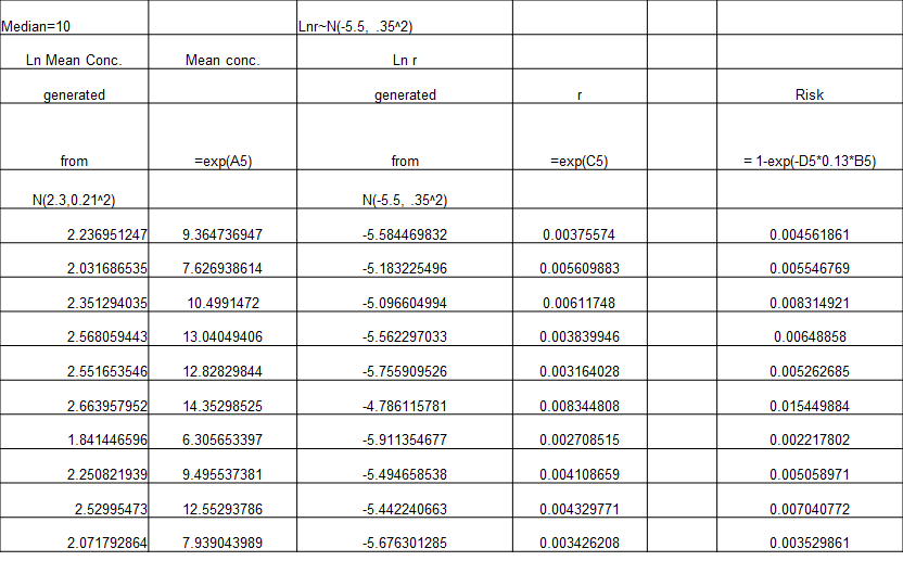
From point estimate to Probabilistic Risk Assessment
- Risk=1-exp(-k x ingestion x concentration)
- Choose input distributions that reflect plausible spread in these values
- Ingestion = 0.13 l/swim
- Ln(mean concentration) ~ N (2.3, 0.212)
- Ln (k) ~N(-5.5, 0.352)
generate LN (k) from normal generator k = exp(generated number)
Here’s what it looks like in Excel
Results to present
- Mean, median, standard deviation
- 5th percentile, 95th percentile
- Histogram of output
- Correlations of inputs with output
In Excel =correl(input column, output column) Where input column is A1:A1000 or similar
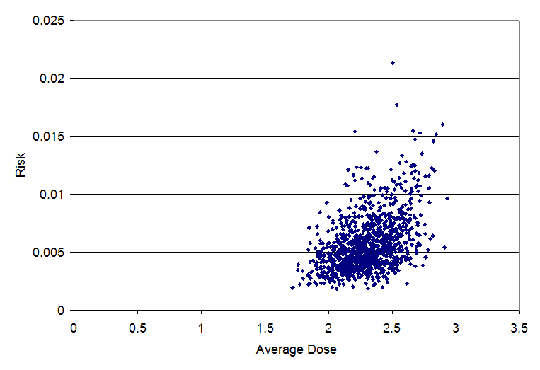
- Scatter plots of inputs with output
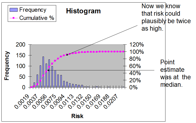
Histogram and cumulative histogram
The blue bars are a histogram showing the frequency with which the estimated risk fell into different bins. The height of the bar indicates our assessment of the plausibility of the risk. Areas with high bars indicate risks that are considered more likely. We often speak of this as the central tendency of the risk estimate.
Areas with shorter bars or no bars are less plausible estimates of risk.
The magenta line is cumulative histogram or cumulative distribution function which shows the fraction of the different model realizations that had a given level or risk or lower. This initially may appear more confusing than the standard histogram. However, it is easy to read the percentiles from this cumulative distribution function. For example to find the median, you locate 0.5 on the y-axis, as the median at 50% of all observations below it. You then see what point on the x-axis corresponds to 0.5 on the y-axis. This point on the x-axis is the media.
Scatterplot: risk vs. average dose (correl=.48)
Scatterplot: risk vs. k (correl=.83)

This higher the absolute value of the correlation, the more important the uncertainty in the parameter is. The uncertainty in the dose response parameter k (which has a correlation of 0.83) is more important than uncertainty in the dose (which has a correlation of 0.48).
How do I develop input distributions?
- Select a best guess or nominal value
- Make this the mean/median
- Develop a range of plausible values
- “I’m 95% sure the value will be between x and y”
- For a normal distribution we have relationship between percentiles and standard deviation
(97.5percentile-mean)/1.96=standard deviation
- Mean and standard deviation define a normal distribution so you now have your input distribution.